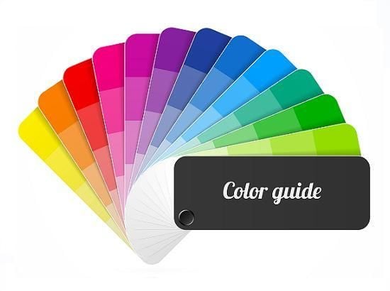
Cherry picking the perfect colours for your website
)
The psychology behind colour choices
The colours we see provoke a small but important emotional response, which makes picking the right combinations very important. If you choose colours that have negative connotations or the wrong kind of tone for your industry, browsers are likely to leave perhaps without even realising what's driven them away.A colour study by academic Satyendra Singh found that it takes a customer only 90 seconds to make a decision about a product, and that anywhere between 62 and 90 per cent of that decision-making process is based on colour alone.
Clever colour associations
The judgement that most customers make about your website based on your colour choices is likely to be a subconscious one, but it's no less powerful for that. There are some colours you'll avoid naturally sludgy brown and sickly yellows are not popular website choices for obvious reasons but for a truly effective website, you need to drill a little deeper. For example:
- Red is a forceful and active colour that provokes passion and excitement. It's also been claimed that red can reduce analytical thinking, making it a popular choice for fun and exciting brands.
- Blue tends to be a calming, reflective colour. More people choose blue as their favourite over any other colour and it is good for giving off a trustworthy and authoritative air.
- Yellow is an optimistic and hopeful colour, making it a good choice for aspirational brands. It suggests friendliness and creativity and can leave browsers feeling confident in their choices.
- Green reflects harmony and balance and has a strong association with the natural world. It is a reassuring and peaceful colour and is a good choice for businesses that want to portray a refreshing and bright image.
- Do remember that you must choose shades that make it easy for your customers to read what's on the page a red background with yellow writing may invoke the right emotional response, but that's no use if your customer can't read it.
Creating a cohesive whole
When choosing the colour palette for your website, you need to think about how you can create a cohesive pattern across all your pages. You don't want users to click from one page to another that has a drastically different shade and design and think that they've accidentally wandered onto another website.Limit your colour choices around three is the perfect amount and make sure that you choose complementary shades so that your website feels as though it hangs together.
Colouring the details
Choosing the right colour scheme for your website means also paying attention to small but very important elements, such as your call-to-action buttons. According to The Gaurdian, Gmail experimented with 41 shades of blue before deciding on the right one for their ad links a choice that helped drive US$200 million a year in ad revenue.
Your 'buy now' and 'learn more' buttons need to be eye catching and prominent, and while you may not have the capability to test 41 different shades of blue, testing different colours and comparing your results could yield a nice increase in purchases.Not sure your colour choices are working for you? Get in touch with your local Bloomtools consultant, and if you're not a client already, a free website assessment could help pinpoint your problem areas.
) Author:Tracey Voyce
Author:Tracey Voyce| Tags:Website Design |
Check Out Our
Recent Articles
- The 2026 Visibility Playbook: How to be Findable, Believable, and Easy t...
- Get Rewarded: How to Double Your Reach by Nailing Social Media Interacti...
- Google’s December 2025 Core Update: What It Means for Your Business
- Your Brand Doesn’t Start With Your Logo - It Starts Inside Your Business
- 2025: The Year AI Search Decides Which Businesses Get Found (and Which D...


